Data visualization bridges high-dimensional numerical arrays and physiological understanding.
This guide operates directly on the shared 5D dataset loaded from ../day_1/data/neural_data.npy (shape 3×3×30×32×6),
delivering precise takeaways for every plot configuration.
Figure Configuration Defaults (rcParams)
Publication-grade graphics begin with consistent global defaults. Rather than manually tweaking fonts, tick widths, and margins on every figure, establish a reusable configuration helper that applies system-wide rcParams.
def setup_publication_style():
    """Configures global Matplotlib defaults for publication figures."""
    plt.rcParams.update({
        "font.family"          : "sans-serif",            # Primary font family category
        "font.sans-serif"     : ["Inter", "Helvetica", "Arial"],  # Font fallback stack
        "axes.spines.top"      : False,                  # Hide top spine boundary
        "axes.spines.right"    : False,                  # Hide right spine boundary
        "axes.linewidth"       : 1.2,                    # Line thickness for left/bottom spines
        "axes.edgecolor"       : "#2E3654",              # Dark slate border color
        "axes.labelcolor"      : "#1E293B",              # Axis label text color
        "axes.titlesize"       : 12,                     # Subplot title font size
        "axes.titleweight"     : "bold",                 # Subplot title font weight
        "axes.labelsize"       : 11,                     # X/Y axis label font size
        "axes.labelweight"     : "medium",               # Axis label font weight
        "xtick.major.width"    : 1.2,                    # X-axis tick line thickness
        "ytick.major.width"    : 1.2,                    # Y-axis tick line thickness
        "xtick.labelsize"      : 9,                      # X-axis tick label font size
        "ytick.labelsize"      : 9,                      # Y-axis tick label font size
        "figure.titlesize"     : 14,                     # Main super-title font size
        "figure.titleweight"   : "bold",                 # Main super-title font weight
        "figure.dpi"           : 150,                    # On-screen render DPI
        "savefig.dpi"          : 150,                    # High-resolution export DPI
        "savefig.bbox"         : "tight",   # Strip redundant outer whitespace
    })
Takeaway: Set axes.spines.top = False and axes.spines.right = False globally to eliminate non-data ink. Use savefig.bbox = "tight" to prevent title clipping on export.
Single Time-Series Plotting
Visualizing an individual electrode channel trajectory. Extracting channel Cz (index 9) alpha power for Control Subject 0 across time points.
ts = data[0, :, 0, 9, 2]  # Control · sub0 · Cz · alpha

fig, ax = plt.subplots(figsize=(10, 3.5))
ax.plot(t_axis, ts, color=COLORS[0], lw=1.5, marker="o", label="Control · sub0 · Cz · alpha")
ax.set_xticks(t_axis)
ax.set_xticklabels(["Baseline", "Task", "Rest"])
ax.set_xlabel("Timepoint"); ax.set_ylabel("Power (μV²/Hz)")
ax.set_title("Alpha Power — Control Group, Subject 0, Channel Cz")
ax.legend(); ax.grid(True, alpha=0.3)
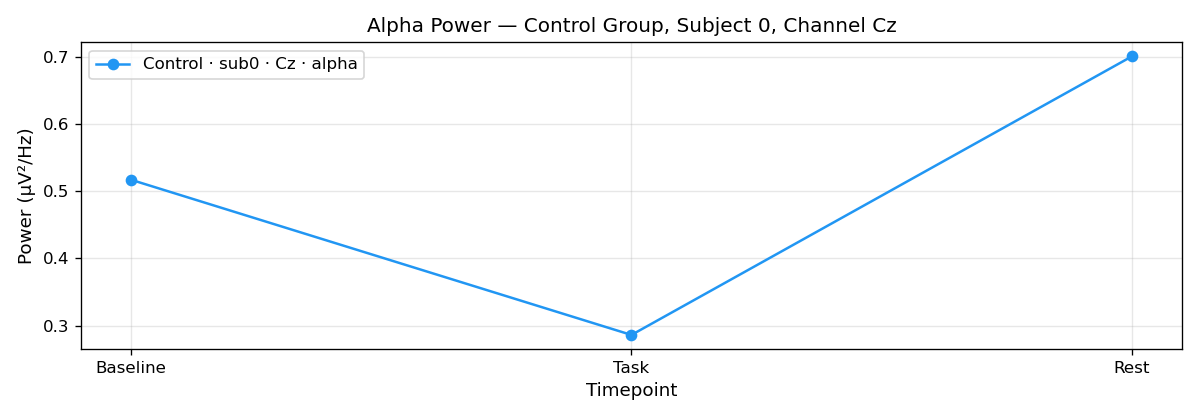
Takeaway: Set explicit categorical tick labels (ax.set_xticks([0, 1, 2]); ax.set_xticklabels(["Baseline", "Task", "Rest"])) for discrete experimental timepoints. Prefer object-oriented axes (ax.plot) over procedural module calls.
Multi-Group Time-Series Overlay
Overlaying grand-average cohort signals (Control, Patient, Treatment) to evaluate group-level temporal differences.
fig, ax = plt.subplots(figsize=(11, 4))
for g in range(G):
    ts_g = data[g, :, :, :, 2].mean(axis=(1, 2))   # Mean over subjects & channels
    ax.plot(t_axis, ts_g, color=COLORS[g], lw=2, marker="o", label=gnames[g])

ax.set_xticks(t_axis)
ax.set_xticklabels(["Baseline", "Task", "Rest"])
ax.set_xlabel("Timepoint"); ax.set_ylabel("Mean Alpha Power")
ax.set_title("Alpha Power Over Time — All Groups")
ax.legend(); ax.grid(True, alpha=0.3)
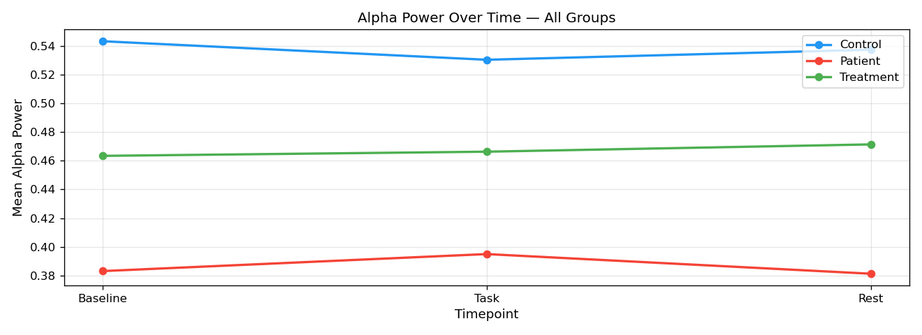
Takeaway: Store an explicit color palette array (e.g. COLORS = ["#2196F3", "#F44336", "#4CAF50"]) to enforce fixed cohort colors across all figures in your study.
Confidence Bands (fill_between ±SEM)
Communicating statistical variance. Shading standard error of the mean (SEM across subjects) reveals whether cohort trajectories are reliably separated.
for g in range(G):
    mu, sem = _mean_sem(g, fi=2)
    ax.plot(t_axis, mu, color=COLORS[g], lw=2, marker="o", label=gnames[g])
    ax.fill_between(t_axis, mu - sem, mu + sem, color=COLORS[g], alpha=0.20)

ax.set_xticks(t_axis)
ax.set_xticklabels(["Baseline", "Task", "Rest"])
ax.set_xlabel("Timepoint"); ax.set_ylabel("Alpha Power ± SEM")

# Place legend at the bottom below the plot frame
ax.legend(loc="upper center", bbox_to_anchor=(0.5, -0.22), ncol=4, frameon=False)
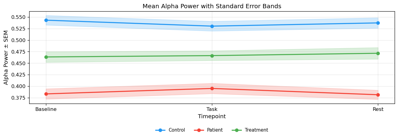
Takeaway: Position legends at the bottom below the plot frame (bbox_to_anchor=(0.5, -0.22)) so labels never obscure signal trajectories or shaded SEM confidence ribbons.
Subplots Grid Layout
Organizing multi-feature matrices across groups into a synchronized subfigure grid using plt.subplots(2, 3, sharex=True).
fig, axes = plt.subplots(2, 3, figsize=(15, 6), sharex=True)
feat_cols = [("Alpha", 2), ("Beta", 3), ("Gamma", 4)]

for row, g in enumerate([0, 1]):
    for col, (fname, fi) in enumerate(feat_cols):
        ax = axes[row, col]
        mu, sem = _mean_sem(g, fi)
        ax.plot(t_axis, mu, color=COLORS[g], lw=1.8, marker="o", label=gnames[g])
        ax.fill_between(t_axis, mu - sem, mu + sem, color=COLORS[g], alpha=0.20)
        ax.set_title(f"{fname} Band", fontsize=10, fontweight="bold")
        ax.set_xticks(t_axis)
        ax.set_xticklabels(["Baseline", "Task", "Rest"])
        if row == 1:
            ax.set_xlabel("Timepoint", fontsize=9)

        # Position legend outside plot area to avoid obscuring signal curves
        if col == 2:
            ax.legend(loc="center left", bbox_to_anchor=(1.04, 0.5), frameon=False)
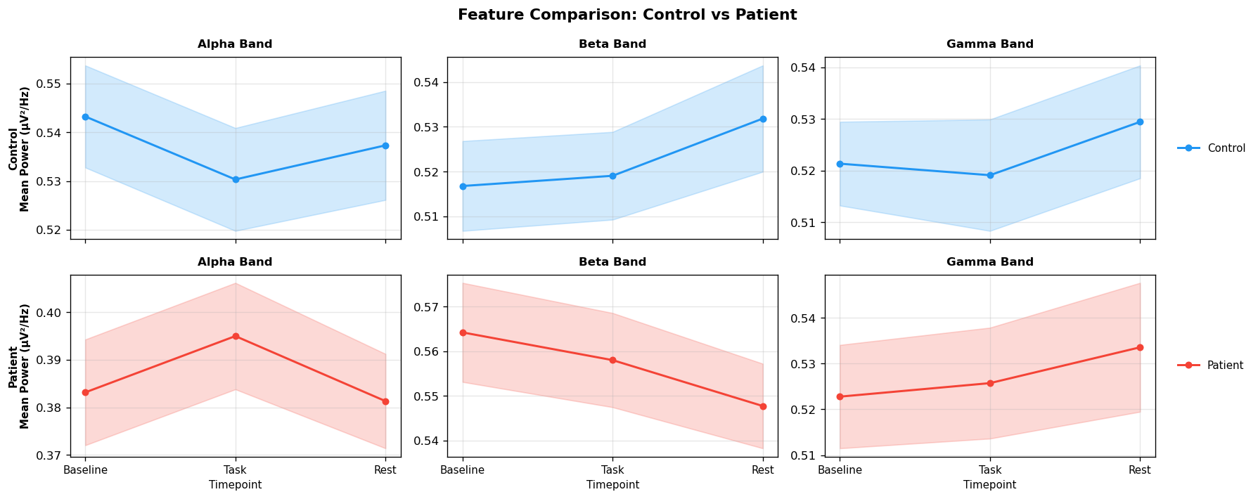
Takeaway: Always place legend boxes outside the plot area (using bbox_to_anchor=(1.04, 0.5)) so labels never obscure signal trajectories or confidence ribbons.
MNE Scalp Topography (mne.viz.plot_topomap)
Projecting 32-channel electrode power onto anatomically accurate 2D scalp topomaps using MNE-Python and standard 10-20 sensor montages.
import mne
from matplotlib.colors import LinearSegmentedColormap

# Benedikt Ehinger's EEG Topographic Colormap (becp)
colors = [(0.2706, 0.4588, 0.7059), (0.5686, 0.7490, 0.8588),
          (0.8784, 0.9529, 0.9725), (1.0000, 1.0000, 0.7490),
          (0.9961, 0.8784, 0.5647), (0.9882, 0.5529, 0.3490),
          (0.8431, 0.1882, 0.1529)]
cmap_becp = LinearSegmentedColormap.from_list("becp", colors, N=256)

# Create MNE Info with standard 10-20 montage
info = mne.create_info(ch_names=chnames, sfreq=hz, ch_types="eeg")
info.set_montage(mne.channels.make_standard_montage("standard_1020"))

fig, axes = plt.subplots(1, 3, figsize=(14, 4))

for g in range(G):
    alpha_power = data[g, :, :, :, 2].mean(axis=(0, 1))  # (32,) channel mean
    vmin, vmax = alpha_power.min(), alpha_power.max()
    im, _ = mne.viz.plot_topomap(
        alpha_power, info, axes=axes[g], show=False, cmap=cmap_becp, vlim=(vmin, vmax)
    )
    axes[g].set_title(f"{gnames[g]} — Alpha Topography")
    fig.colorbar(im, ax=axes[g], shrink=0.75, pad=0.04)
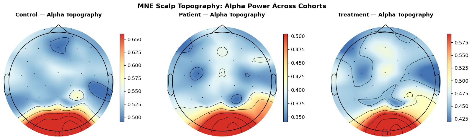
Takeaway: Prefer MNE topomaps over rectangular heatmaps for spatial channel data — polar 2D head geometry provides true anatomical spatial interpolation.
Raincloud Distributions (Cloud + Box + Rain)
Replacing bar graphs with Raincloud Plots. Combining half-KDE density shapes, narrow boxplots, and raw data scatter points delivers complete distribution transparency.
import scipy.stats as stats

for g in range(G):
    sub_vals = data[g, :, :, :, fi].mean(axis=(0, 2))  # per-subject mean
    color = COLORS[g]

    # 1. Cloud: Half-KDE density plot
    kde = stats.gaussian_kde(sub_vals)
    y_grid = np.linspace(sub_vals.min() - 0.04, sub_vals.max() + 0.04, 100)
    density = (kde(y_grid) / kde(y_grid).max()) * 0.28
    ax.fill_betweenx(y_grid, g + 0.06, g + 0.06 + density, color=color, alpha=0.45)

    # 2. Umbrella: Narrow box plot
    ax.boxplot(sub_vals, positions=[g], widths=0.08, patch_artist=True,
               boxprops=dict(facecolor=color, alpha=0.8),
               medianprops=dict(color="white", lw=1.8))

    # 3. Rain: Jittered raw subject scatter points
    jitter = RNG.uniform(-0.06, 0.06, size=len(sub_vals))
    ax.scatter(g - 0.18 + jitter, sub_vals, color=color, alpha=0.65, s=28)
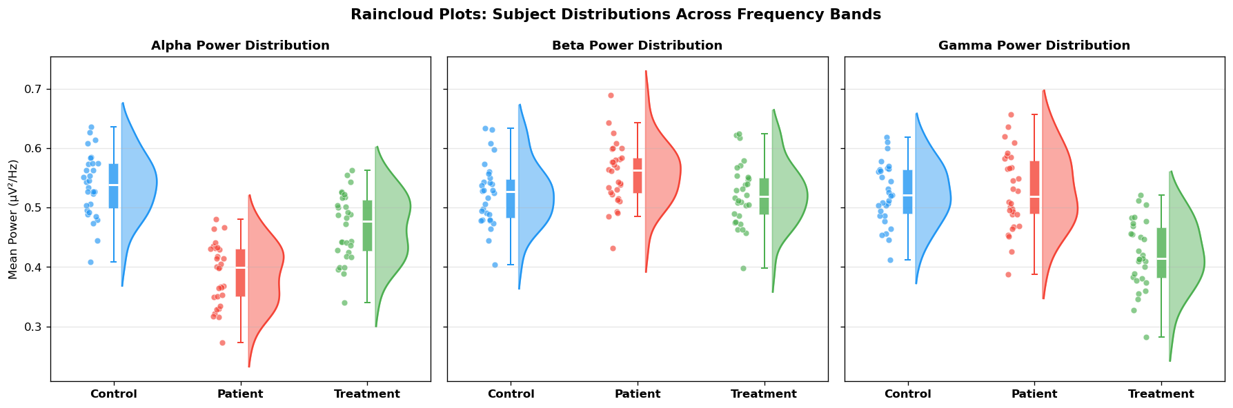
Takeaway: Bar charts hide multimodal shapes and subject sample sizes. Rainclouds reveal true raw subject data points alongside summary statistics.
Annotated Correlation Matrix
Evaluating feature co-activation across frequency bands by computing Pearson correlation matrices (np.corrcoef).
Data Pooling: By reshaping data[g] from (T=3, S=30, C=32, F=6) into (T*S*C, F) → (2880, 6), we pool subjects across all timepoints (Baseline, Task, Rest) and all 32 electrode channels into $2{,}880$ total observations to estimate robust cross-frequency coupling for each cohort.
for g in range(G):
    # Flatten cohort into (T*S*C, F) = (2880, 6) -> pools subjects across all timepoints & channels
    mat  = data[g].reshape(-1, F)
    corr = np.corrcoef(mat.T)
    im   = axes[g].imshow(corr, cmap="RdBu_r", vmin=-1, vmax=1)

    # Overlay annotated text with dynamic contrast
    for i in range(F):
        for j in range(F):
            col = "w" if abs(corr[i, j]) > 0.60 else "k"
            axes[g].text(j, i, f"{corr[i,j]:.2f}", ha="center", va="center", color=col)
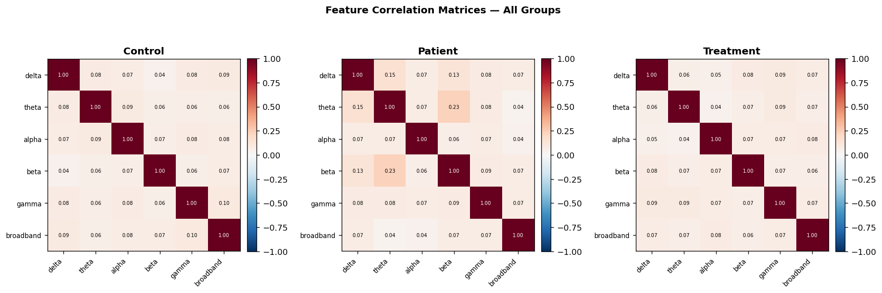
Takeaway: Always center diverging colormaps (e.g. RdBu_r) at zero with vmin=-1, vmax=1 for correlation matrices, and switch text color dynamically for contrast.
Journal-Ready Figure & MNE Delta Topomap
Assembling a two-panel publication figure combining subject-level scatter relationships in Panel A with an MNE Patient − Control delta scalp topomap in Panel B.
setup_publication_style()

fig, (ax1, ax2) = plt.subplots(1, 2, figsize=(13, 5))

# Panel A: Alpha vs Beta scatter per subject
for g in [0, 1]:
    sub_alpha = data[g, :, :, :, 2].mean(axis=(0, 2))
    sub_beta  = data[g, :, :, :, 3].mean(axis=(0, 2))
    ax1.scatter(sub_alpha, sub_beta, c=COLORS[g], alpha=0.72, s=65, label=gnames[g])

# Panel B: Patient - Control Delta Topomap (Benedikt Ehinger becp colormap)
diff_alpha = data[1, :, :, :, 2].mean(axis=(0, 1)) - data[0, :, :, :, 2].mean(axis=(0, 1))
vlim = np.abs(diff_alpha).max()

im, _ = mne.viz.plot_topomap(
    diff_alpha, info, axes=ax2, show=False, cmap=cmap_becp, vlim=(-vlim, vlim)
)
ax2.set_title("(B) Patient − Control Δ Alpha Topography")
fig.colorbar(im, ax=ax2, shrink=0.75, pad=0.04, label="Δ Alpha Power")
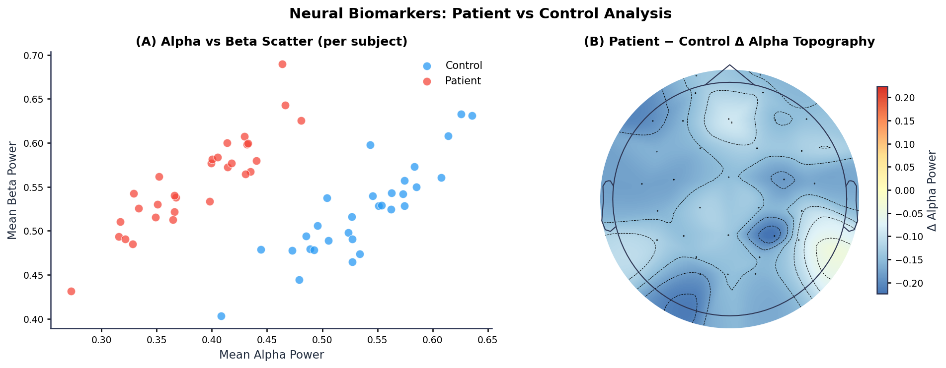
Takeaway: On difference topomaps (Patient - Control), set symmetric limits vlim=(-vlim, vlim) with a zero-centered diverging colormap so blue indicates power reduction and red indicates power enhancement.
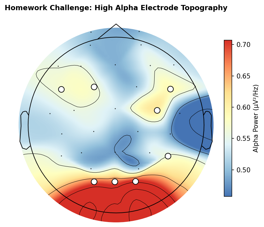
Homework Challenge: High Alpha Electrode Topography
🎯 Objective: Recreate the Highlighted Scalp Topography Below
Your task is to write a Python script using mne.viz.plot_topomap that reproduces this target figure. You need to identify channels with high alpha power during baseline rest in healthy controls and visually highlight them with white indicator markers.
- Cohort & Condition: Select the Control group (
g=0), Baseline timepoint (t=0), and Alpha power feature (fi=2). - Channel Mean: Compute the average alpha power across all 30 subjects for each of the 32 electrode channels (result shape:
(32,)). - Thresholding: Identify channels where alpha power exceeds the 75th percentile threshold (hint:
np.percentile(alpha_base, 75)). - MNE Visualization & Limits: Render the 2D scalp topography with the Ehinger (
becp) colormap. Explicitly setvminandvmaxto the exact minimum and maximum values of the data array being plotted (e.g.vmin = alpha_base.min()andvmax = alpha_base.max(), passed viavlim=(vmin, vmax)) so the colormap spans the full data range. - Electrode Highlighting: Pass a boolean
maskand custommask_paramstoplot_topomapso that channels exceeding the threshold are overlaid with prominent white dots with a crisp border.